Book a call
Banq
Product Strategy
Discovery
User Research
UX/UI Design
Branding
Design System
Reinventing the banking app.
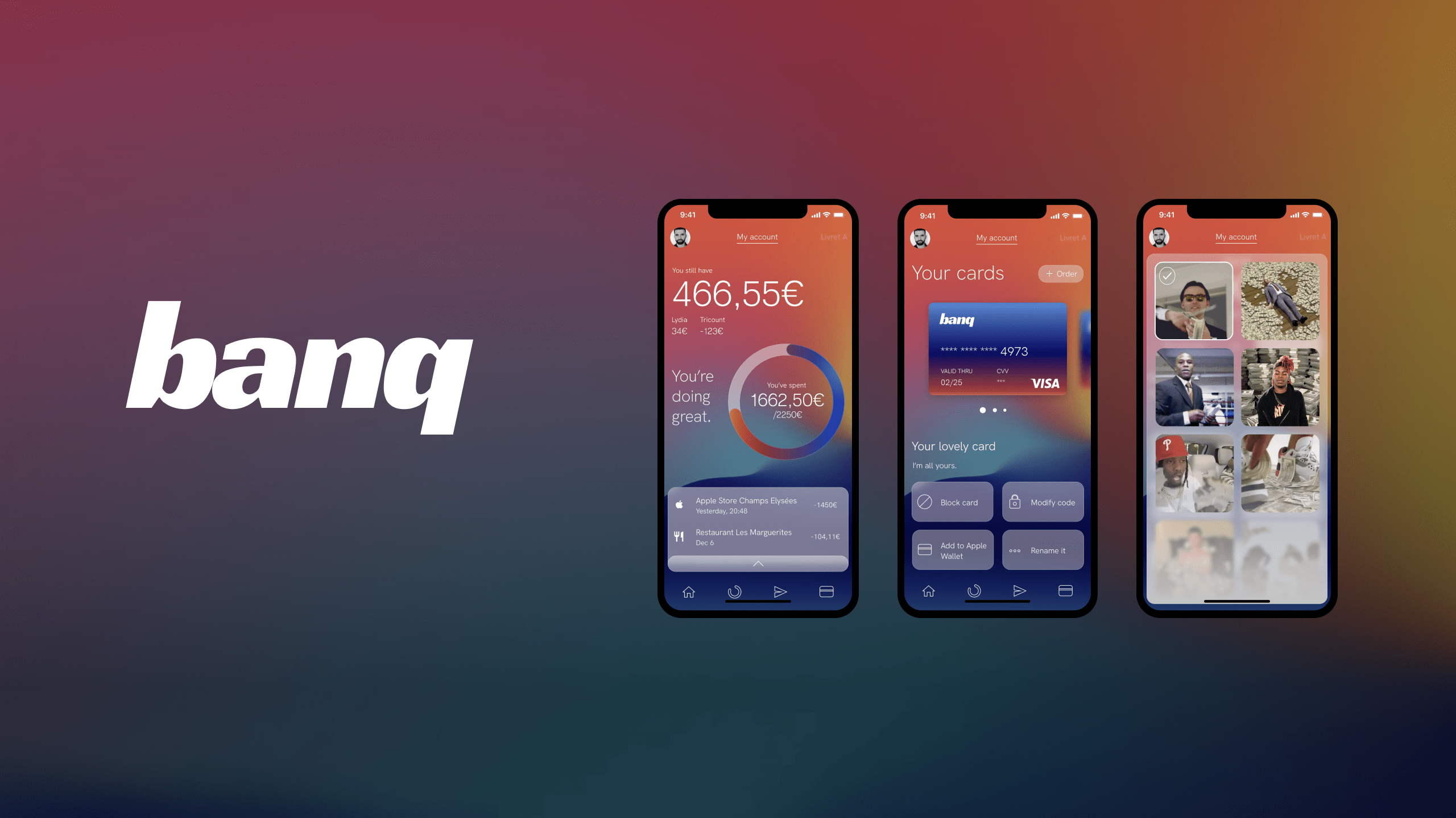
banq is a banking app project with the objective to simplify as much as possible the essential operations of a bank.
It recreates a positive emotional link between the bank and its customer.
To achieve this, I used several Design Thinking tools and an MVP oriented approach.
Identify friction points.
Opening a banking app is often associated with a perceived negative feeling, like checking your accounts after an overspend.
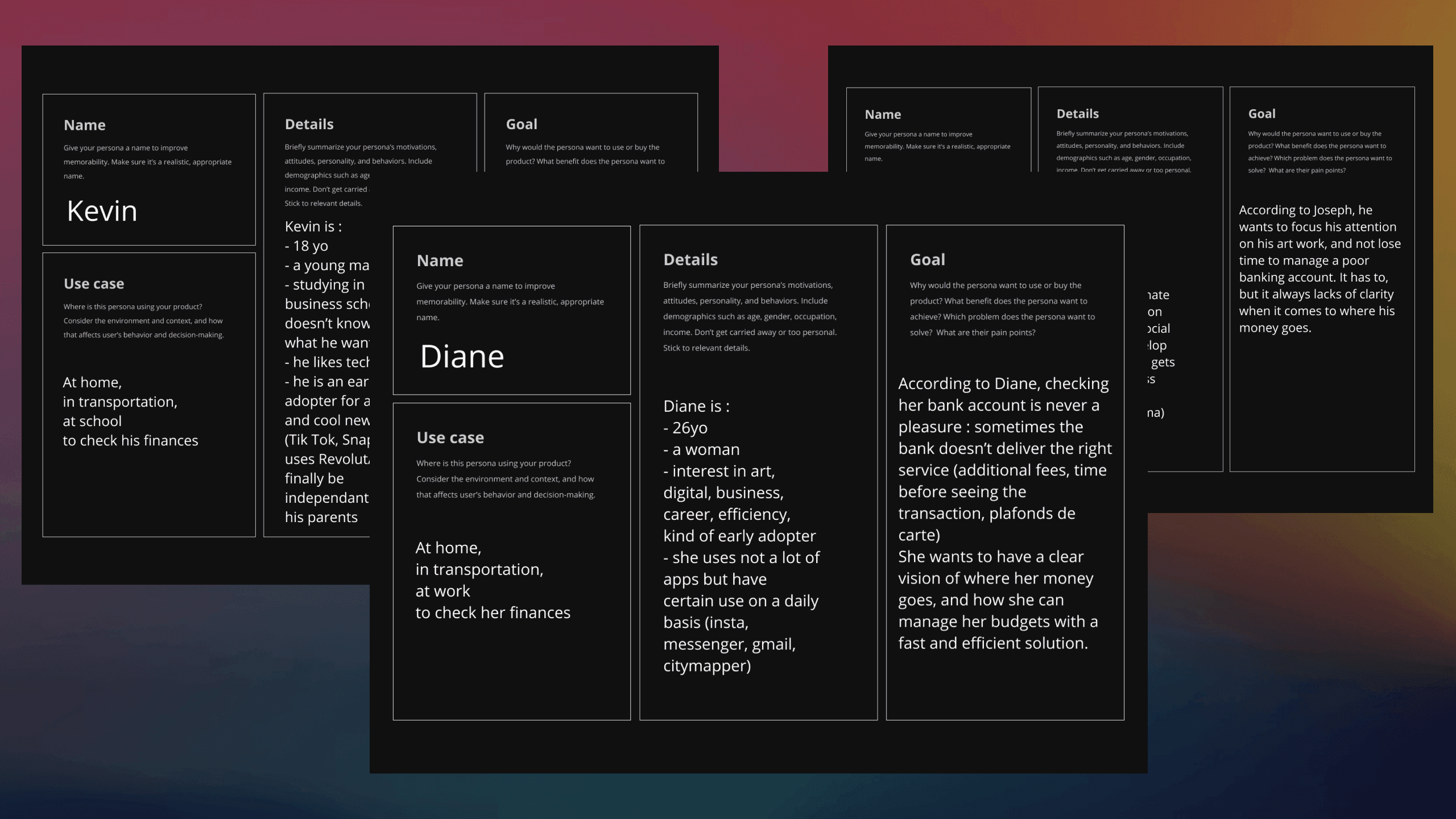
To validate this idea with the market, I identified 3 persona profiles corresponding to 3 people I know.
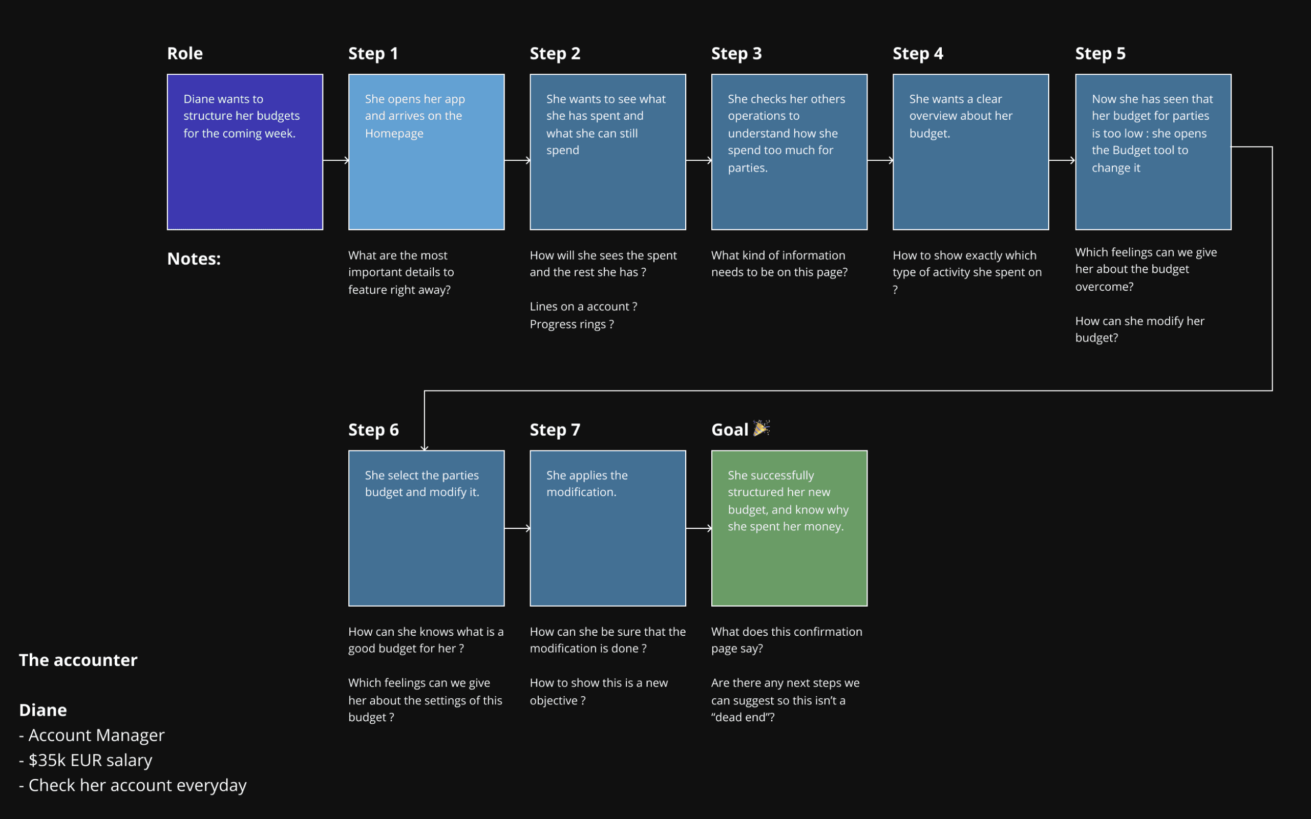
I then built their User Flow, each one having a specific objective to achieve by using the product. I checked with the people the validity of these hypotheses by modifying them, simplifying them and emphasizing key points after their feedback.
Research, MVP, and structure.
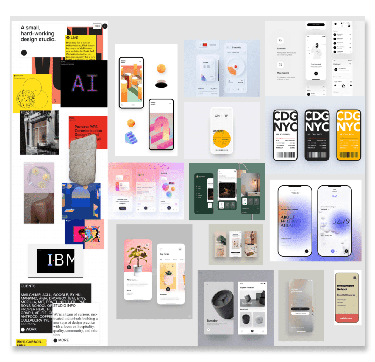
I started my benchmark with the 3 main products on the French market: BNP Paribas, Revolut and Bankin'. Each one has its advantages and disadvantages, and each one offers a different hierarchy of information.
Existing functionalities (budget construction for Bankin, bank card management for Revolut) and non-existing ones (integration of services such as Lydia or Tricount) were integrated into banq.
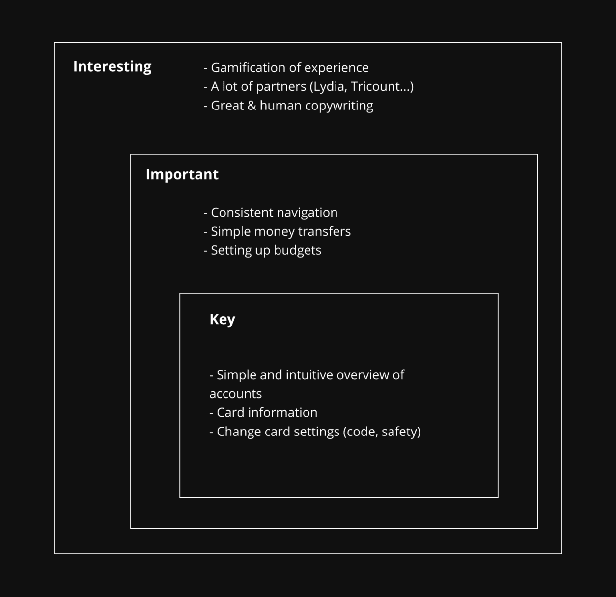
This research and the User Flows allowed me to define precisely which features I was going to include in my product and with what priority.
The UX journey.
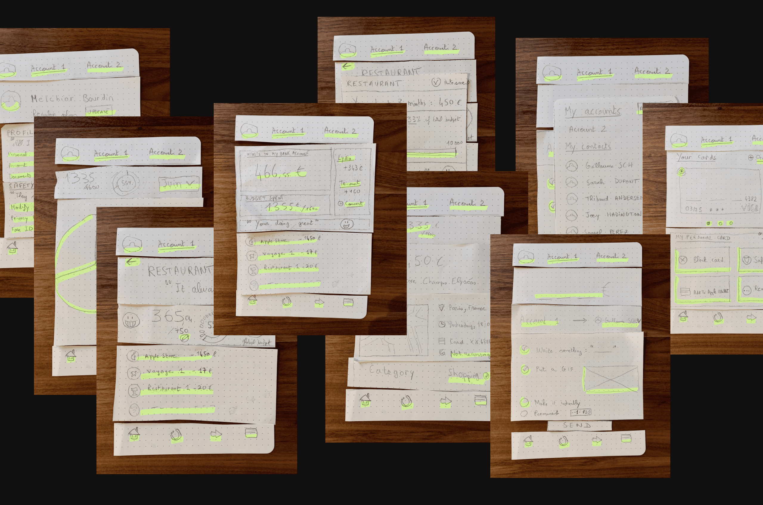
I worked on paper prototypes to prioritize the different information in each screen and build a simple and intuitive structure for each feature.
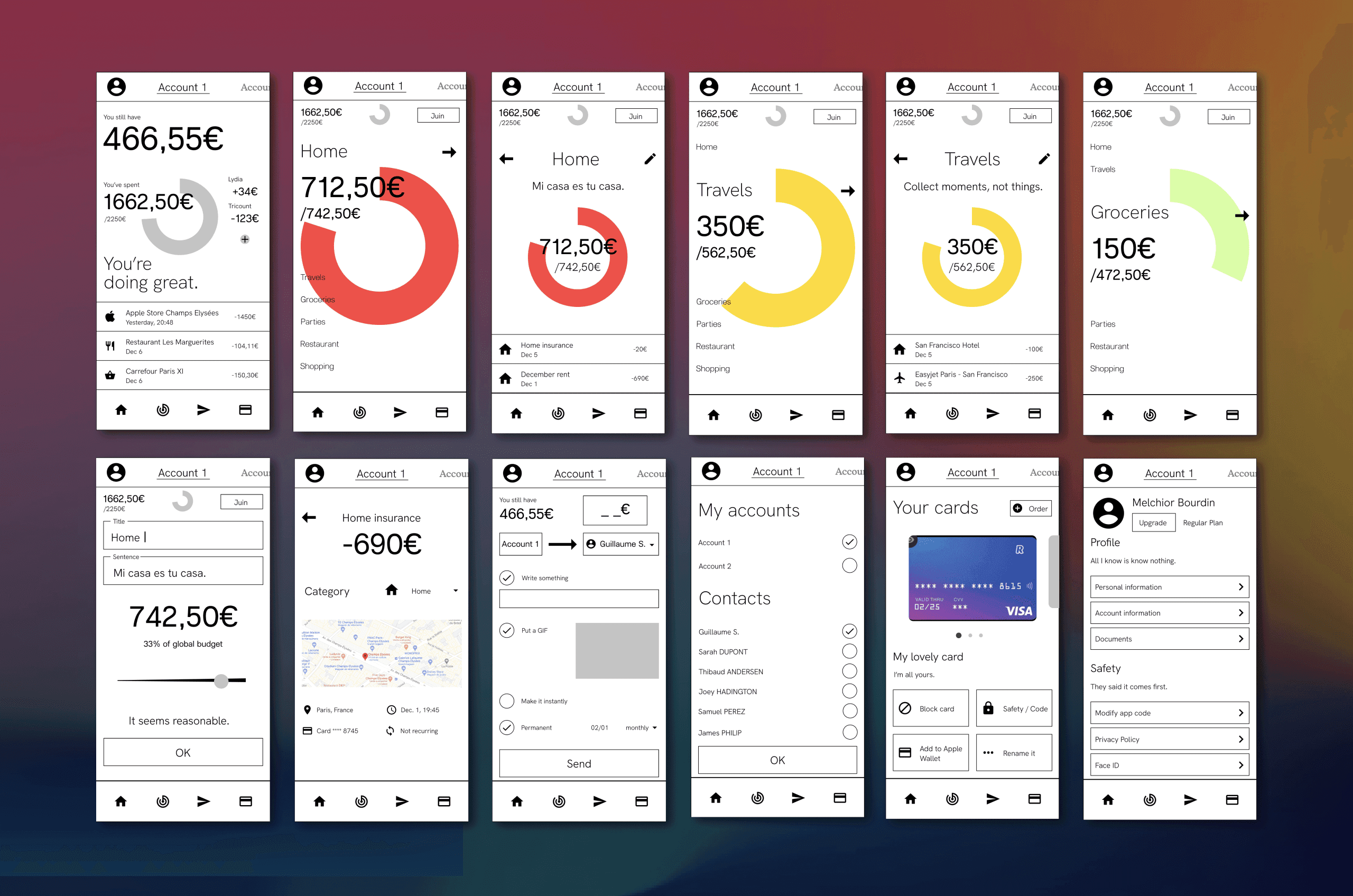
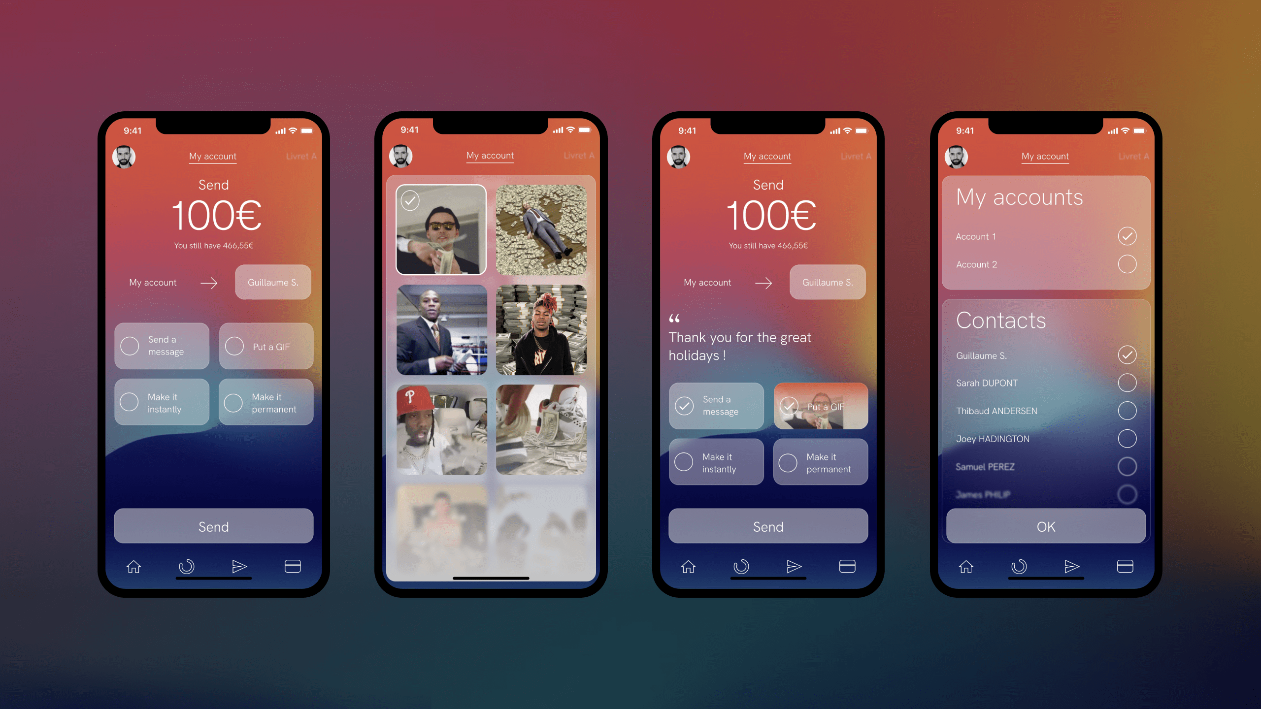
Redundant schemas like the account selection were simplified. I favored a by action approach with a main menu close to the thumb indicating the 4 main possible actions in the app.
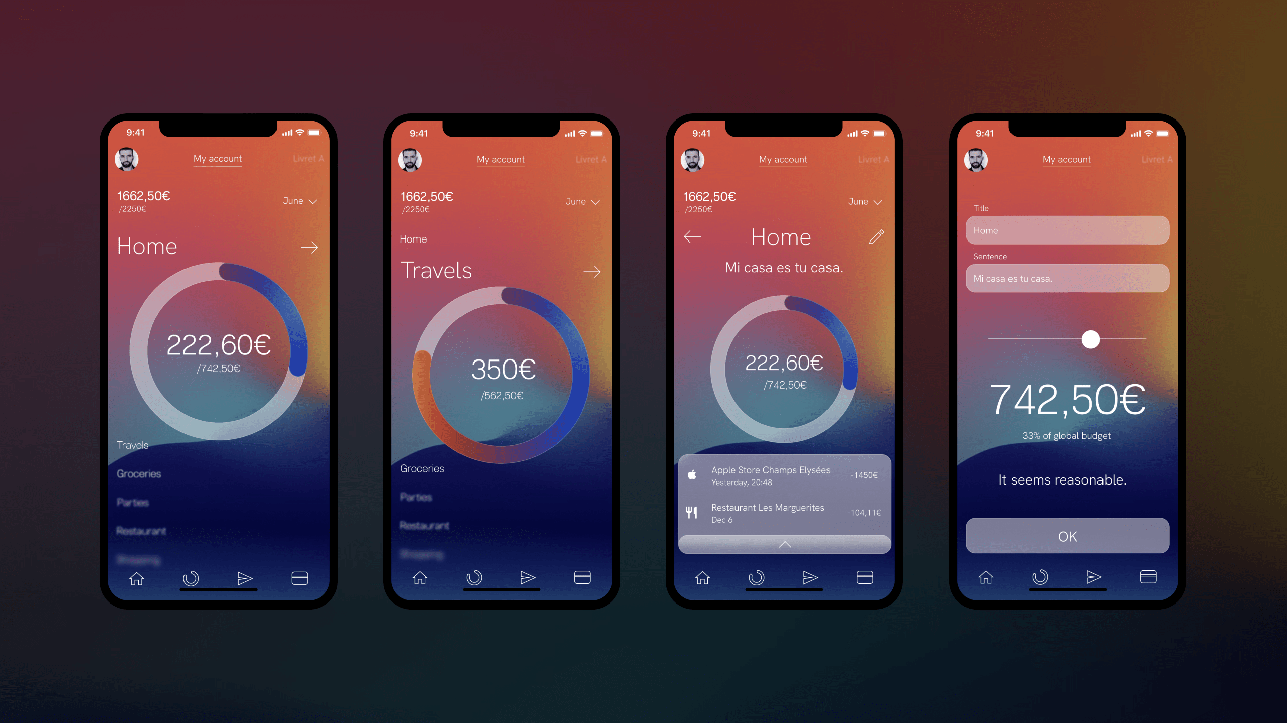
The gauge structure for the global budget and the budgets by theme (Home, Travel...) is inspired by the design work on the Apple Watch. Complemented by a color code from blue to red, it gives the user a clear overview of his expenses and gamifies the experience.
The user knows at a glance where he stands in his finances.
The importance of UX writing is also emphasized to give a more human aspect to the app which is presented as an understanding and motivating advisor.
After several user tests on paper prototypes and many modifications, I was able to validate my hypotheses.
The breakdown follows a "Components" approach specific to the Design System.
The next step was the creation of wireframes. Here too several modifications after prototyping on Figma in order to offer the best possible experience (type size, element size, page structure...).
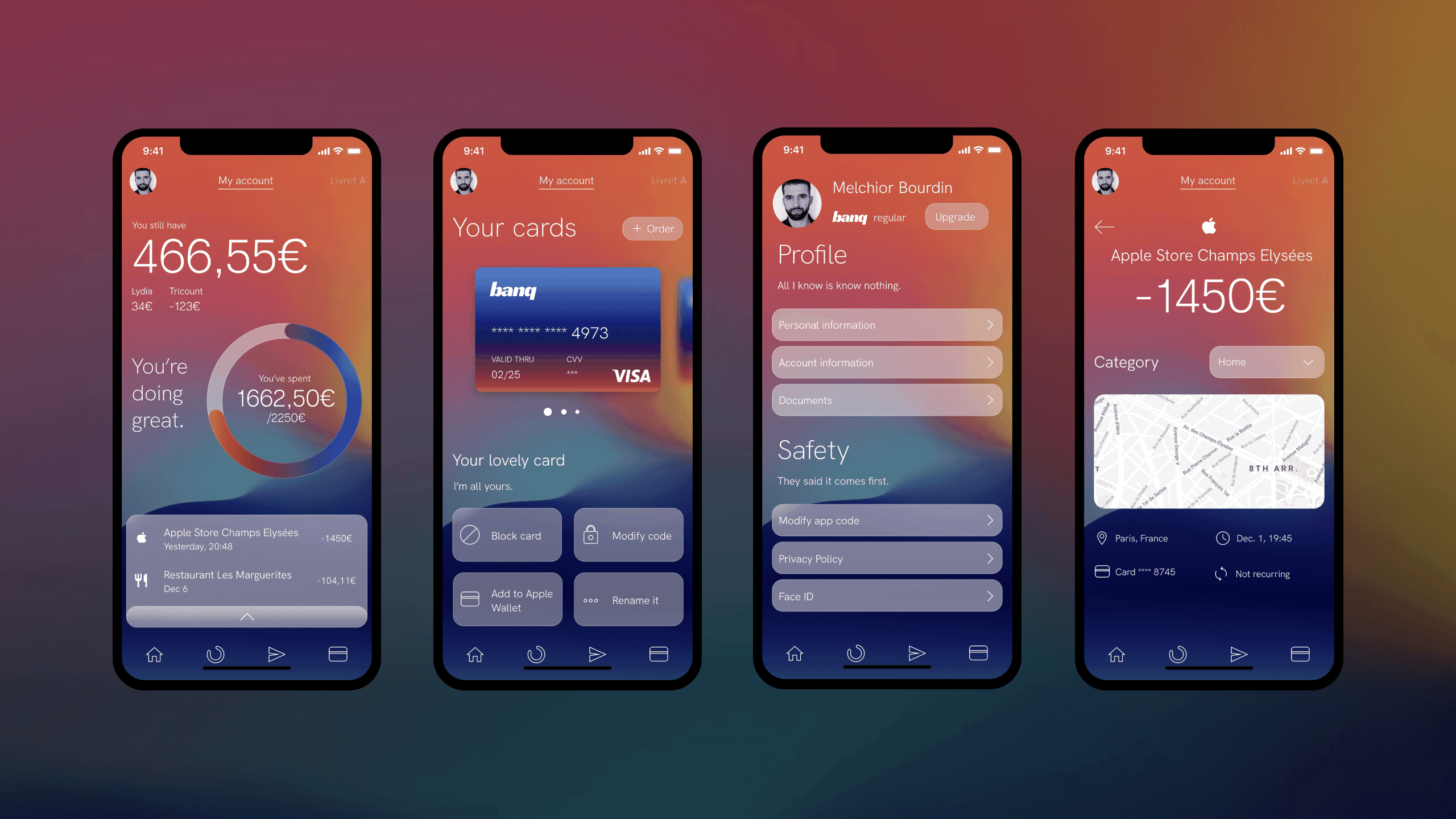
The UI design, which is at once minimalist, colorful and warm, is inspired by the glassmorphism specific to the iOS aesthetic. It brings a modern and elegant coloration to the UX base of the app. The interactive elements are highlighted with a glass background.
The UI combines the colors of blue and red that represent the health status of the account by linking it to emotions (hot/cold, positive/negative).
The fine, sans serif typography provides clear and elegant information, as do the minimalist icons.
The resulting branding keeps the same color scheme and tone of voice as the product.
It is completed by a large and pop logo that rejuvenates and modernizes the classic bank.
© Copyright 2023, Melchior Bourdin.
